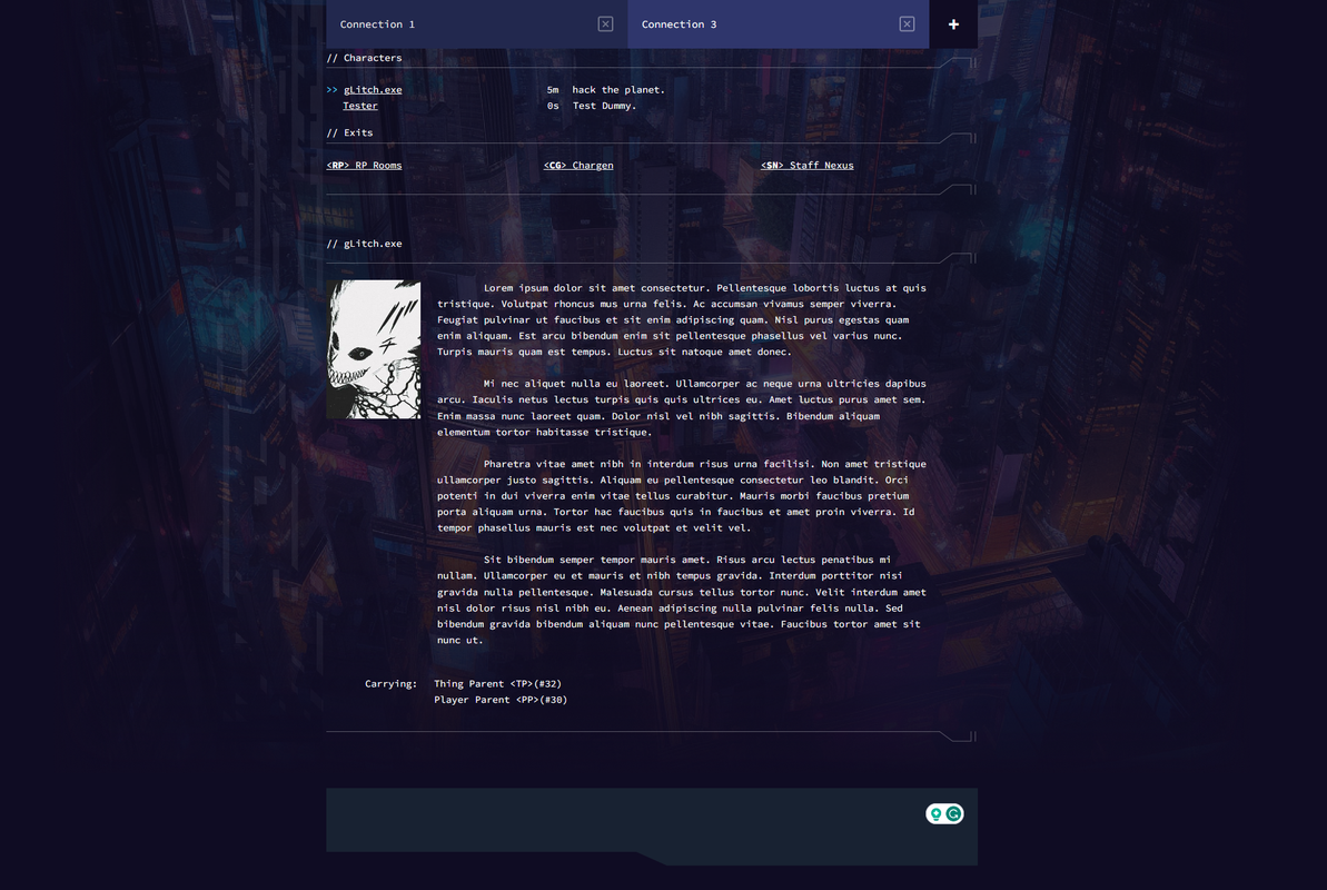
-
Hey all! It’s been a hot minute since I’ve had a chance to update here. Work, life, you know the deal. Now how about some cyberpunk-ish design? I wasn’t sure which category to put this under, so… Comments & Feedback it is!

During my free time I’ve been using working with older tech to make beautiful things. First, a custom MediaWiki skin! This was fun! Creating skins for that platform has come a long way from where it used to be, I’ll tell ya!
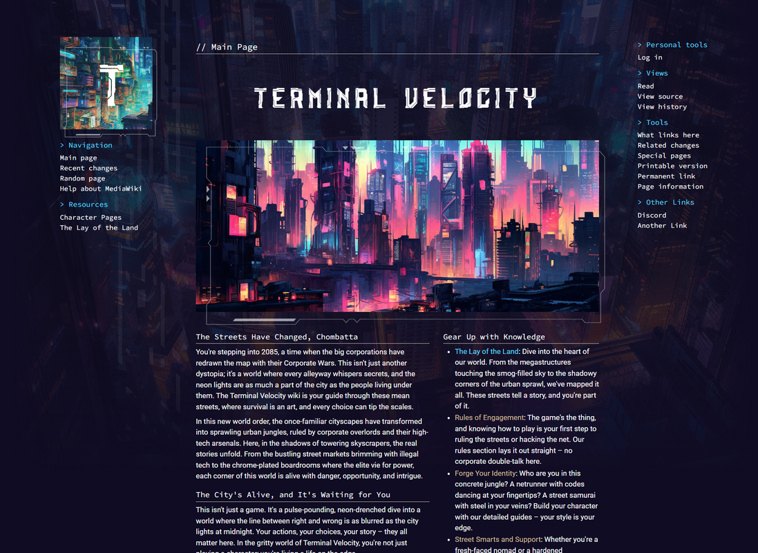

I’ve also decided to tackle another problem! A web client for this conceptual MUX, so! I’ve been tinkering with this highly experimental thing that follows the same cyberpunk-ish design. I’m basically leaning hard on MUX’s Pueblo functionality (Remember that?!)
It’s very early stages still - but I’ve made sure to include some things like an expanding entry window, on-demand auto-scrolling, and a friggin’ history, because not being able to arrow up for last command was driving me bonkers.
 Next is getting those mobile styles ship-shape I think.
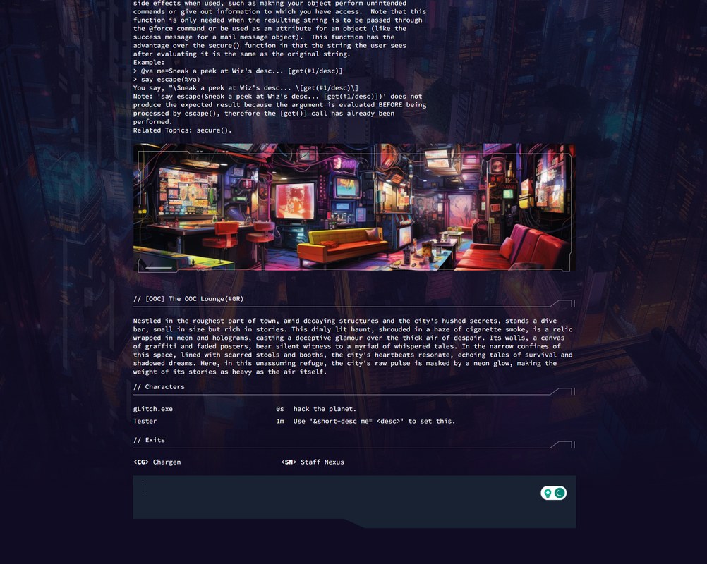
I’m not sure what I’m going to do with this. I’ve entertained opening something, but I really don’t have the bandwidth to run stories for people right now.
Anyways! It’s been fun to work on, so I thought I’d share! More updates later hopefully, if I remember about here again, soon!
-
Whoops! After another look, this is definitely the wrong category. >.<
-
 T Tez moved this topic from Comments & Feedback on
-
@Kumakun I bounced it over.

-
@Tez Hey thanks!

-
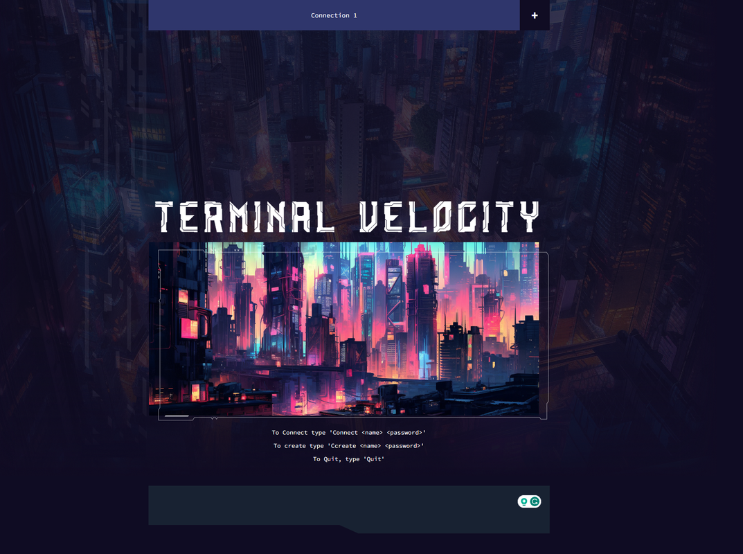
Small update!
I’ve been working at the client a little, and I’m pretty pleased with my progress.
- Tabs are working now. So you can connect to multiple characters in one window. (Closing a tab is my current task).
- I updated the connect screen!
- Various quality-of-life improvements.
I’m getting close to accomplishing what I set out with this one. Fun project!

-
Mobile View!
I’ve also added an out-of-focus activity indicator for each in-browser-window tab and the browser tab itself.
 I think I’m about done and ready to bring in some folks for testing.
Once I’m done with the MVP (soon), I’ll build this in something like Svelte for actual production. I did this in vanilla HTML/CSS/JS, which means the JS is MESSY and not modular! Plus, It’ll have some quality-of-life severe techniques for handling reactivity that are FAR less verbose (for me).
Anywho, screenshot!
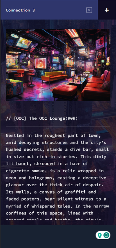
Let me know if you want to take this for a test spin. I need a few at this point, and it’s not ready for a full-on stress test yet.

-
@Kumakun This honestly looks so rad.
-
@Yam Haha, thanks! It’s been fun to build. Every day I tinker, I move closer and closer to wanting to hash out CP Red rules in Mushcode so I can take this thing for a real spin.

-
I had fun adding this, so I thought I’d share!
I am working on player/thing descriptions. The avatar isn’t required but spices the interface up a little. I want to address a few more commands; then, I have to decide if I want to start adding Cyberpunk Red elements.

